Re-desigining the website and enchancing brand character
Role
UI/UX Desginer
Web Designer
Toolkit
Figma
FigmaJam
Year
2024
The client
FreeKids decided to redesign their website to address customer feedback and improve usability, while also refreshing their brand image. They believed that a stronger online presence would help them keep pace with competitors and better meet their clients' evolving needs. The plan was clear, but time was limited—FreeKids was determined to launch version 1.0 within three months of first contact.
How did I help?
With no established guidelines in place, my role was to lead the entire process from scratch. I came with a list of features and we prioritize them giving them simple one of the four ranks: necessary, nice to have in 1.0, to implement in 2.0, cut it. Scope was ready based on necessary feartures.
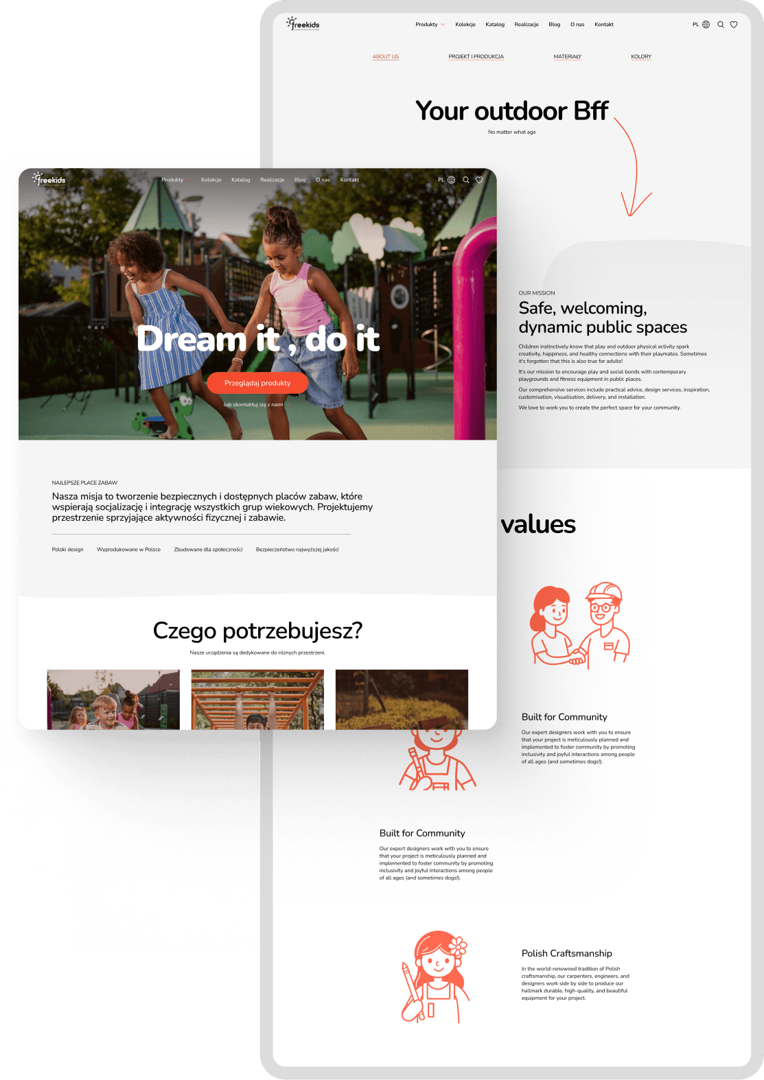
Redesigning a website from scratch
To understand the product, I conducted a thorough competitive analysis of both the Polish and international markets, creating a report that later helped me establish industry standards. I also interviewed FreeKids team members who work directly with clients to gain insights into who their customers are.
Basing on my research and a list of necessary features, I started working on the platform design. Work began with creating a site map and a content plan for the landing and subpages, all guided by the conversion goals we established with the team.
Designing a new style that communicates effortlessly with clients
FreeKids wanted its brand to be renewed. Due to time constraints, a full rebranding wasn’t possible, so I focused on small updates that refreshed the brand.
The update aimed to communicate adaptability to market conditions while showcasing a customer-centric, playful design. I opted for a color refresh, minimalist design, and playful doodle accents. I also developed definitions of styles, colors and typography.
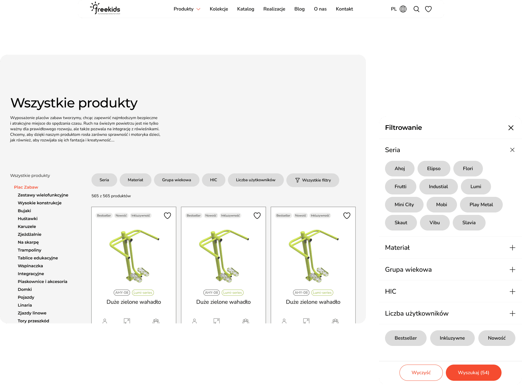
How to use filters? How to search products?
While working on this project, I encountered several challenges related to user experience design, which I’ll highlight in this case study. The first challenge was product categorization, closely linked to the filtering process. I had to identify the most influential characteristics that impact user choices, while also considering what users are familiar with, as the website is intended for both new and returning customers.
I decided to categorize the products into two main types: by area and by series. This decision was based on research and the assumption that it would cover all the ways users typically search for products.
The result
The result of our two-month collaboration is a comprehensive website design, ready for implementation. The process included competitor research, exploring visual directions, developing information architecture, and designing layouts and solutions for features like search, filtering, and product inquiries, all aimed at improving user experience. Our partnership also increased the team's awareness of the importance of good design.